Showing posts with label #coronavirus. Show all posts

Friday, July 3, 2020

Information industry jobs changes are mixed as economy re-opens from Covid-19

Three of the six information industries gained jobs in June and job losses slowed in the other three industries, according to preliminary labor department statistics.

Total employment in all six Information industries is still about 11 percent less than it was in February before stay home orders began. The six industries, which employed about 2.9 million people in February, had lost about 315,000 jobs by June.

However, the June jobs report is the first indication that some Information industries may be joining the recovery from the pandemic that began last month for sectors like Construction and Retail.

This post describes changes in employment for all six Information industries from June 2019-June 2020. The post does not include employment in selected occupations, which can be found in last month's post on Information jobs.

The first chart shows aggregate employment in all six industries.


The chart (above) shows monthly changes in Information sector employment. Data from the U.S. Bureau of Labor Statistics is seasonally adjusted to remove predictable influences such as seasonal changes or holiday hiring. This provides a more accurate estimate of changes from factors like the pandemic.

May and June employment statistics are preliminary and subject to revision.

The six Information industries employed more than 2.8 million people from June 2019-Feb. 2020. The industries lost jobs in March, April, and May before a small recovery in June.

June 2020 Information employment was still an estimated 315,000 jobs lower than in Feb. 2020, a decline of 10.9 percent. The Information sector employed an estimated 2.57 million people in June. 

Information is part of the private, nonfarm business sector which employed 129.7 million people in February 2020. The sector lost an estimated 21 million jobs in April, then added jobs in May and June. However, in June the sector was still down 13.1 million jobs since February, a decline of  10.2 percent.

Subsequent charts report employment in each of the six Information industries.


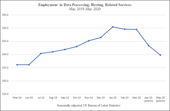
The second chart (above) shows employment in Data Processing, which includes hosting and providing data processing services.

Data Processing had the largest employment increase from May to June, adding an estimated 5,600 jobs. Employment is now 345,500, which is still below the 349,600 jobs in February.

Total job losses since February are estimated to be 4,100, a decrease of 1.2 percent.


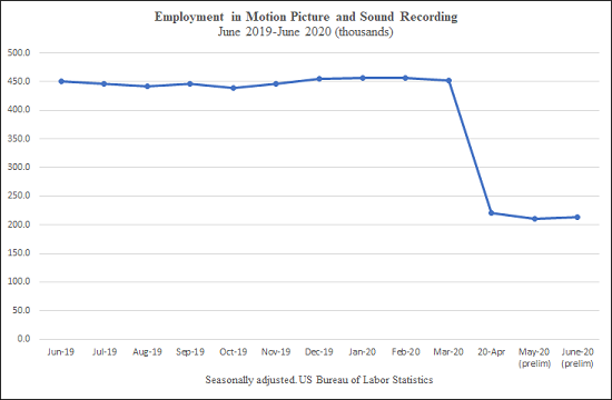
The third chart (above) shows Motion Picture and Sound Recording, which includes the production and distribution of motion pictures and sound recordings.

This industry had the second largest employment gain from May to June, adding an estimated 2,600 jobs. However, employment was still far below the February figure of 456,000. 

Motion pictures and sound lost an estimated 243,700 jobs by June, or about 53.4 percent.

This unusually large decline may result from requirements that many people work in the same place when making a movie or a recording. Covid-19 makes physical proximity dangerous.


The fourth chart (above) shows Other Information Services, which includes search engines, internet-only publishing and broadcasting, and web sites that store and provide information.

This industry had the third largest employment gain from May to June, adding about 2,200 jobs.

Other Information jobs increased from February to March, before declining in April and May. Employment is still below the peak in March.

However, June's estimated employment figure is 1,200 higher than than the 354,400 jobs in February, an increase of 0.34 percent.


The fifth chart (above) shows Publishing, which includes newspapers, magazines, books, directories and software publishing. 

Job losses slowed in in June when the industry lost an estimated 600 jobs, the largest monthly loss in the Information sector.

Publishing had 770,000 jobs in February and lost an an estimated 30,700 jobs by June, a decrease of 3.9 percent.


The sixth chart (above) shows Telecommunications, which includes distribution and services for telephones, cable and satellite broadcasting, and internet access.

Employment losses in Telecommunications also slowed, an estimated decrease of 300 jobs in June was the second largest monthly loss in Information. 

The industry employed about 700,000 people in February. Telecommunications employment was down 12,400 June, an estimated decrease of 1.8 percent.


The seventh chart (above) shows Broadcasting, an industry that creates, acquires and distributes content via radio, television, cable and other subscription services.

Broadcasting employment decreased by an estimated 200 jobs in June, the smallest monthly loss in the Information sector.

The industry employed 263,300 people in February. Broadcasting lost an estimated 25,000 jobs by June, a decrease of 9.5 percent.

Comments

The pandemic continues to have the smallest effect on employment in Other Information Services, which may have two advantages. First, many employees can work from home. Second, there was increased demand for internet services as millions of people were ordered to stay home as much as possible. 

The June increase in Data Processing jobs is consistent with continued or increased demand for technology-based products and services. Job losses in Telecommunications continued in June, perhaps because the widespread loss of income during the pandemic reduced demand for telephone and cable services.

Motion Picture and Sound Recording remains the hardest hit industry despite the gain of 2,600 jobs in June. This change is too small to say if the large-scale production of movies, television programs and recordings is starting to resume.

Publishing and broadcasting job losses slowed, but these industries did not recover in June.

Sunday, May 24, 2020

Employment changes in Information industries after Covid -19 shutdowns

Post updated June 11, 2020

More than 10 percent of all Information Industry jobs were lost by May, according to preliminary labor department statistics.

There are six Information industries which employed about 2.8 million people in February before stay home orders began. Jobs were lost in all of the six industries.

None of the Information industries gained jobs in May as some stay home orders were relaxed. There were job gains in other sectors such as Construction, Manufacturing, Financial activities, and Retail.

The Motion Picture and Sound Recording industry was hardest hit among Information industries -- more than half of its 456,000 jobs were gone by May.  Five other industries suffered job losses ranging from more than 8 percent in Broadcasting to 0.37 percent in Other Information Services. Other Information includes search engines and digital publishers and broadcasters.

This post describes changes in employment for all six Information industries from May 2019-May 2020. I also report employment in selected occupations as of May, 2019.

The first chart shows aggregate employment in all six industries.


The chart (above) shows monthly changes in Information sector employment. Data from the U.S. Bureau of Labor Statistics is seasonally adjusted to remove the influence of  predictable influences such as seasonal changes or holiday hiring. This provides a more accurate estimate of changes caused by factors like the pandemic.

April and May employment statistics are preliminary and subject to revision.

The six Information industries employed more than 2.8 million people from May 2019-Feb. 2020. The industries had lost an estimated 316,000 jobs by May, a decline of 10.9 percent.

Information is part of the private, nonfarm business sector which employed 129.7 million people in February 2020. The sector had lost an estimated 21 million jobs by April.  Some industries in this sector added jobs in May. But the entire sector was still down 17.9 million jobs since February, a decline of  13.8 percent.

Subsequent charts report employment in each of the six industries.


The second chart (above) shows Other Information Services, which includes search engines, internet-only publishing and broadcasting, and web sites that store and provide information.

Employment increased by 19,000 jobs from May 2019-Feb. 2020. Other Information employed 354,400 people in February. 

The industry added jobs in March. However, Other Information had lost an estimated 1,300 jobs by May, a decrease of 0.37 percent.

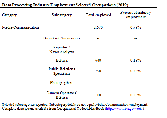
The table (below) reports 2019 employment in selected occupations. This is the most recent available data.


Employment in selected occupations is a rough indicator of the relative importance of specific jobs. However, these jobs may not be evenly distributed across the entire industry.

About 6 percent of Other Information employees were in Media occupations in 2019. Half were editors, and less than 2 percent were reporters

Editors may be employed at digital firms that do and do not produce original content. Reporters, however, are concentrated at a small number of digital news publications.

Computer jobs (not shown) are also reported for each industry to provide a comparison. Computer jobs and technology can be used to produce, distribute, and sell media and other information products.  

Computer jobs were 24.2 percent of employment in Other Information in 2019.


The third chart (above) shows Telecommunications, which includes distribution and services for telephones, cable and satellite broadcasting, and internet access.

Employment in Telecommunications decreased by about 16,000 jobs from May 2019-Feb. 2020. The industry employed about 700,000 people in February.

An estimated 12,800 jobs were lost by May, a decrease of 1.8 percent.


Media occupations were less than 1 percent of this industry in 2019. The industry does not produce original media content, so this is expected.

Computer jobs (not shown) accounted for 16.3 percent of employment in Telecommunications.


The fourth chart (above) shows Publishing, which includes newspapers, magazines, books, directories and software publishing. 

Employment in Publishing increased by about 12,000 people from May 2019-Feb. 2020. The industry had 770,000 jobs in February.

An estimated 28,000 jobs were lost by May, a decrease of 3.6 percent.


Media workers were about 10 percent of all Publishing jobs in 2019. Editors were almost 6 percent of industry jobs, probably because editors were employed by magazines and book publishers in addition to newspapers. Reporters were 2.5 percent of the industry, jobs that were concentrated in newspapers.

Computer occupations (not shown) accounted for 31 percent of Publishing jobs in 2019. Computer jobs may be more widely distributed than media jobs in this industry.


The fifth chart (above) shows Data Processing, which includes hosting and providing data processing services.

Employment increased by about 13,000 jobs from May 2019-Feb. 2020. Data Processing employed about 349,000 people in February.

An estimated 9,800 jobs were lost by May, a decrease of 2.8 percent.


Less than 1 percent of jobs were in Media occupations in 2019. This is another industry that does not produce media content.

Computer jobs (not shown) accounted for 40 percent of Data Processing employment. This is expected because the industry is defined by computing.


The sixth chart (above) shows Broadcasting, an industry that creates, acquires and distributes content via radio, television, cable and other subscription services.

Broadcasting employment decreased by about 4,000 jobs from May 2019-Feb. 2020. The industry employed 263,300 people in February.

Broadcasting lost an estimated 23,000 jobs by May, a decrease of 8.7 percent.


About 21 percent of Broadcasting jobs were in Media occupations in 2019. Broadcast Announcers and Disc Jockeys were 9 percent of all jobs, probably because they were employed by television and radio stations.

Reporters were about 6 percent of all jobs and camera operators and editors were 3.6 percent of jobs, possibly because these were concentrated at television stations.

Computer jobs (not shown) accounted for just 4.8 percent of Broadcasting employment in 2019.


The seventh chart (above) shows Motion Picture and Sound Recording, which includes the production and distribution of motion pictures and sound recordings.

Employment was steady at about 450,000 people until February 2020. 

The industry lost an estimated 240,900 jobs by May, or about 52.7 percent.

This unusually large decline may result from collaboration between many people in the same place when making a movie or a recording. Covid-19 makes physical proximity dangerous.


Only 3.5 percent of Motion Picture and Sound jobs were in Media occupations in 2019.

Camera operators and editors were listed as a major category, accounting for another 3.5 percent of all jobs. There were more than twice as many camera operators and editors, 27,560, as in Broadcasting with 9,690. 

Computer jobs (not shown) were just 1.5 percent of employment in Motion Pictures and Sound.

Comments

Employment changes during the pandemic are probably influenced by whether employees can keep working, how much demand and revenue still exists for the industry's products, and long-term employment trends.

The pandemic is having the smallest effect on Other Information Services. This may be because employees can work from home. This may also result from increased demand for internet services when millions of people were ordered to stay home as much as possible. Online advertising is generally cheaper than ads in Broadcasting or Publishing, so increased demand also means the industry can continue selling ads.

Smaller adverse effects on employment also appear in other industries where technology may allow people to work from home, such as Data Processing and Telecommunications. However, both industries employ thousands of sales agents who may be unable to work. Telecommunications demand for cell phone services may also be affected if customers are losing their jobs and incomes.

Publishing jobs losses are increasing. Some employees may be able to work from home such as book and magazine editors and computer employees. Employment in Publishing as a whole was also increasing before the pandemic.

However, some Publishing sectors such as newspapers had decreasing employment before the pandemic. The initial pandemic response from some large newspaper companies included cutting hours worked and using furloughs to avoid layoffs. But these are interim measures that might not be enough to stave off layoffs.

The largest adverse effects appear to be industries where workers must gather in the same location to produce news and entertainment products. Broadcasting is also losing advertising revenue because large advertisers are reducing spending as consumers buy fewer advertised products.

Most dramatically, Motion Picture and Sound Recording jobs vanished as the production of movies and television programs shut down.

Thursday, April 30, 2020

A note on minimizing common problems reporting trends in Covid-19 statistics

Some of the most widely-reported statistics about Covid-19 are based on daily updates of total "new" cases in the previous 24-hours. These updates are used to track increases and decreases in everything from the number of tests to the number of deaths from the pandemic.

But these daily totals can be misleading. The day that a case is first reported may not be the day the case actually occurred. Cases are often reported days or weeks after their occurrence because of lags in the collection and distribution of Covid-19 data.

Reports that use the actual day a case occurred are a better way to measure trends. But  day of reports can also be misleading because of lags in reporting cases.

The problems created by lags are especially apparent in many popular dashboards that use graphics to illustrate Covid-19 trends.

The Ohio Department of Health is an exception. The department's dashboard features clear presentations of Covid-19 trends that include the limitations of the data.

The Ohio data is updated every day at 2 p.m. I used data from multiple updates to produce my own graphics and analysis for this post. I have no affiliation with the Ohio Department of Health.


I am using Ohio deaths as an example of general problems reporting Covid-19 tests, cases, hospitalizations and other measures. Covid-19 trends are often reported with bar charts, so I will do the same.

My first two charts (above) show total "new" deaths reported each day in orange. The blue chart shows days that each death actually occurred. Both charts illustrate the period from the first Ohio coronavirus death to April 21.

The orange chart shows that March 20 is the first day that "new" Ohio deaths were reported. But the blue chart shows the first death actually occurred on March 17.

You can also see the orange distribution of "new" deaths does not accurately depict the actual  distribution of deaths in blue.

The number of "new" deaths being reported appeared to be increasing on April 21. But the blue chart shows that deaths per day appeared to be decreasing.


These next charts (above) include data from eight more days, extending the analysis from April 21 to April 29. The orange chart includes a dramatic spike on April 29 because 138 "new" deaths were first reported on that day.

The spike is misleading. The blue chart includes these "new" deaths on days the deaths actually occurred. The blue chart again shows the actual number of deaths per day appear to be decreasing.

But the blue chart also uses lagged data, making it incomplete and possibly misleading. Recall the decline in my first blue chart ending on April 21. That decline  vanished after eight days of updates.

Five of the 138 "new" deaths occurred on unknown dates, so they are not reported in the blue chart. This is not unusual, dates are normally added in subsequent updates. But this is another example of how lags complicate efforts to identify Covid-19 trends.


This next graphic (above) compares both charts of "new" deaths reported each day. Ovals highlight April 14-21. The distribution of deaths did not change from the first to the second chart. This shows how daily totals can persistently misrepresent the distribution of deaths.


This graphic (above) compares both charts of the actual number of deaths each day. Ovals highlight April 14-21.

The distribution of deaths changed from the first to the second chart. The first chart incorrectly shows a decline in deaths. The second chart shows deaths were actually constant or increasing from April 14-21.

This illustrates how the accuracy of lagged data improves over time. As more deaths were reported the counts for the highlighted days were revised upward.

Lags are typically concentrated in the most recent days in any report. So the decline that now appears from April 22-29 might also disappear after new updates in coming days.
 

My last charts (above) show running totals, another common way to report trends associated with Covid-19. The orange chart is "new" deaths reported each day, and the blue chart is deaths occurring each day.

Circles highlight the most recent seven days. The running total of "new" deaths shows a rapid increase in deaths. This is not accurate.

The running total of deaths each day shows slower increases that are starting to level off. But this may change when daily death reports are updated with lagging data. So this curve might also be inaccurate.

Better ways to accurately report trends associated with Covid-19

A complete count of cases associated with Covid-19 probably will not be available for months or years. But the public, public health officials, and policy makers cannot wait that long. There is enormous demand for immediate information because we need to slow the virus now.

The best way to minimize the inaccuracies created by lagging data is by averaging over a long period of time. Most of this period should be days where counts have stabilized, and major revisions have ended.

For example, counts for the number of deaths in Ohio are typically revised for about 10 days after initial reporting, so trends should be for periods of at least 30 days. But counts for the number of  hospitalizations are typically revised for a much longer period so trends should account for this difference.

I use the percent change every three days to estimate Covid-19 trends. An example is (April 28 deaths/April 25 deaths). This measure, from economist Arnold Kling, is simple and intuitive -- a result larger than 1 means deaths are increasing, smaller than 1 means deaths are decreasing.

I then calculate the median change for the most recent 30 days to determine the trend.a This statistic was 1.06 on April 29, meaning the median three-day change in deaths was a 6 percent increase. Six days earlier the median three-day change was 1.17, or a 17 percent increase. So increases in Ohio deaths may have slowed.

Similar measures are the best way to report other trends associated with Covid-19. But I don't think its realistic to expect such statistics to become the norm.

However, reports should stop focusing on daily reports of "new" cases. Instead report the current total number of cases for a relevant period of time.

The best measure of a trend is cases on the actual days the cases occurred. This should be the preferred measure for reports whenever the data is available.

Regardless of the measure, the time period should be part of every report. This period should minimize the number of days still being revised because of lagging data. All reports should explain the limitations of the measure being used.

Graphics that show trends across time should only be used for day of data. These graphics should explain that counts for recent days may change because of lags reporting data.

a The median minimizes the influence of unusually large changes, or outliers.

Saturday, March 7, 2020

Coronavirus is a test for local journalism, will it pass?


Information and misinformation about the new Coronavirus has for weeks been easily available to anyone with an Internet connection -- i.e. almost everyone in the United States. So news organizations that don't cover this story until the virus is detected in their community are failing an important test.

People want information because they are justifiably concerned about the Coronavirus. Many people are getting sick, and some are dying. There is not yet a medicine or vaccine to treat the virus.  Mobile phones and computers make it easy to find, follow, and share reports about the virus on social media, search engines, and websites.


Local journalists compete directly with the information that people are finding on the internet. Journalists who aren't covering this story are losing this competition and signaling irrelevance to potential audiences. This is not a good strategy when local journalism is struggling to survive.

Searches coincide with developments in the news

I live in Athens, Ohio, a state that has not yet reported any infections. But Google's data on the volume of Coronavirus searches shows interest in Ohio coincides with major news about the virus.


The chart compares Ohio searches on the topic of Coronavirus with Ohio searches on the topic of the flu from December to March. Each topic includes many different search terms. Interest is measured on a scale from zero to 100, where 100 represents a peak in searches.1 

The chart begins Dec. 31, 2019, when China first reported the new virus to the world, according to a timeline in the New York Times. Searches for informaiton on the flu have not changed much in response to virus news, but the opposite is true for Coronavirus. 

The first Coronavirus case in the United States was reported on Jan. 21, 2020, the day the first spike in Ohio searches begins. The Trump administration announced restrictions on travel from China on Jan. 31, 2020, which was followed by the rapid decline in searches that ended the first spike.

The second spike in Coronavirus searches began Feb. 23, 2020, the day that authorities in Italy responded to a major outbreak by shutting down some Italian towns. The next day the Trump administration asked Congress for $1.25 billion to combat the virus in the United States. Searches in Ohio have been spiking ever since.

The trends in Ohio show journalists throughout the state should have been covering the story no later than Jan. 21.

I live in Athens, home to Ohio University which has extensive international connections and a medical school. So I've been surprised by the lack of coverage in two local newspapers that claim to serve the community. The first Coronavirus story that I read in either paper was just published in The Athens News three days ago, March 4, 2020.I might have missed some earlier stories, but that's because there were few or none.

Ohio is not uniquely interested in Coronavirus. Google data shows interest across the United States coinciding with the same major developments in the Coronavirus story.


Journalists can develop unique local stories

Coronavirus is a complicated story involving science, public health, politics, and local jobs and businesses. So many local journalists will probably have to learn a lot of new information at the same time they are covering the story.

Repeating information that is already available on the internet will not make local stories competitive. Local journalists must provide new and valuable information to attract and hold audience attention.


Fortunately, the internet also gives local journalists direct access to the global conversation among experts trying to contain the virus. This makes it possible to quickly find accurate information that can be used to develop differentiated local stories. 

For example, former FDA Commissioner Dr. Scott Gottlieb has warned that local health departments and hospitals might be rapidly overwhelmed if the virus becomes epidemic. His concerns are discussed on his Twitter feed (@ScottGottliebMD), which also references his op-eds in the Wall Street Journal and elsewhere.


Local journalists who publish stories on the limited resources available to fight an epidemic are likely to attract an audience that will stay with them for additional coverage. 


Journalists risk losing audiences if they don't cover this story

Local news organizations have limited staff. Many local newspapers are struggling financially. But journalists who don't re-order priorities to provide continuing coverage of the Coronavirus risk making those problems worse.

When someone is concerned or frightened they keep looking until they find information that answers their concern. Someone who cannot get local Coronavirus information from their community newspaper or television station will go elsewhere to find what they need. They might never return.


The Coronavirus is a major test of credibility for local journalists. But the virus is also an opportunity for journalists to show audiences why their work matters. I hope journalists pass this test.


1  According to Google, trends data is based on representative samples of all searches on a topic. The samples are used to create an index measuring the proportion of searches on a topic. Increases/decreases mean a larger/smaller proportion of searches in Ohio or the United States were about Coronavirus or the flu. This shows increases/decreases in interest about a topic. Charts do not show the actual number of searches.